The Death of the Hero: Why E-commerce's Greatest Champion Has Become Its Biggest Liability
 Tim Gaunt
Every great story needs a hero -someone who swoops in to save the day, commands attention, and delivers the crucial message when it matters most. For over two decades, the web had its champion: the hero banner. Bold, prominent, and undeniably powerful, it dominated homepages across the digital landscape, from the humblest startup to the mightiest e-commerce empire.
But like all heroes in the greatest tales, this one's time has come to an end.
The hero banner - that massive, singular message that lords over every homepage - has transformed from saviour to liability. What once rescued websites from cluttered, unfocused designs now prevents them from serving their diverse audiences effectively. The very qualities that made hero banners heroic -their dominance, their singular focus, their unwavering presence- have become the source of their downfall.
When Heroes Become Villains
The tragedy of the hero banner lies not in its intentions but in its limitations. Like a well-meaning protagonist who can only save one person at a time, the hero banner can only deliver one message to an entire audience. This worked in simpler times, when businesses had narrower product lines and less diverse customer bases. But in today's complex e-commerce environment, the hero's greatest strength (its ability to command absolute attention) has become its greatest weakness.
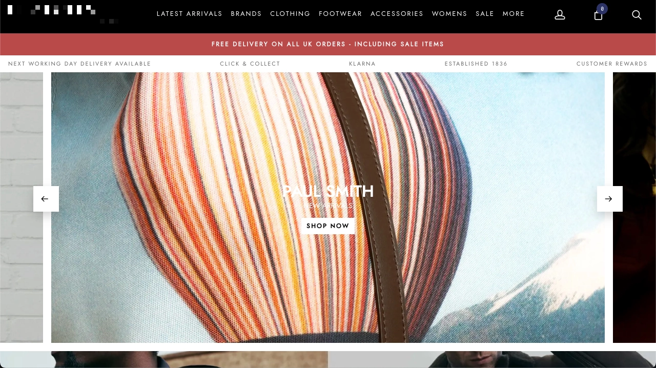
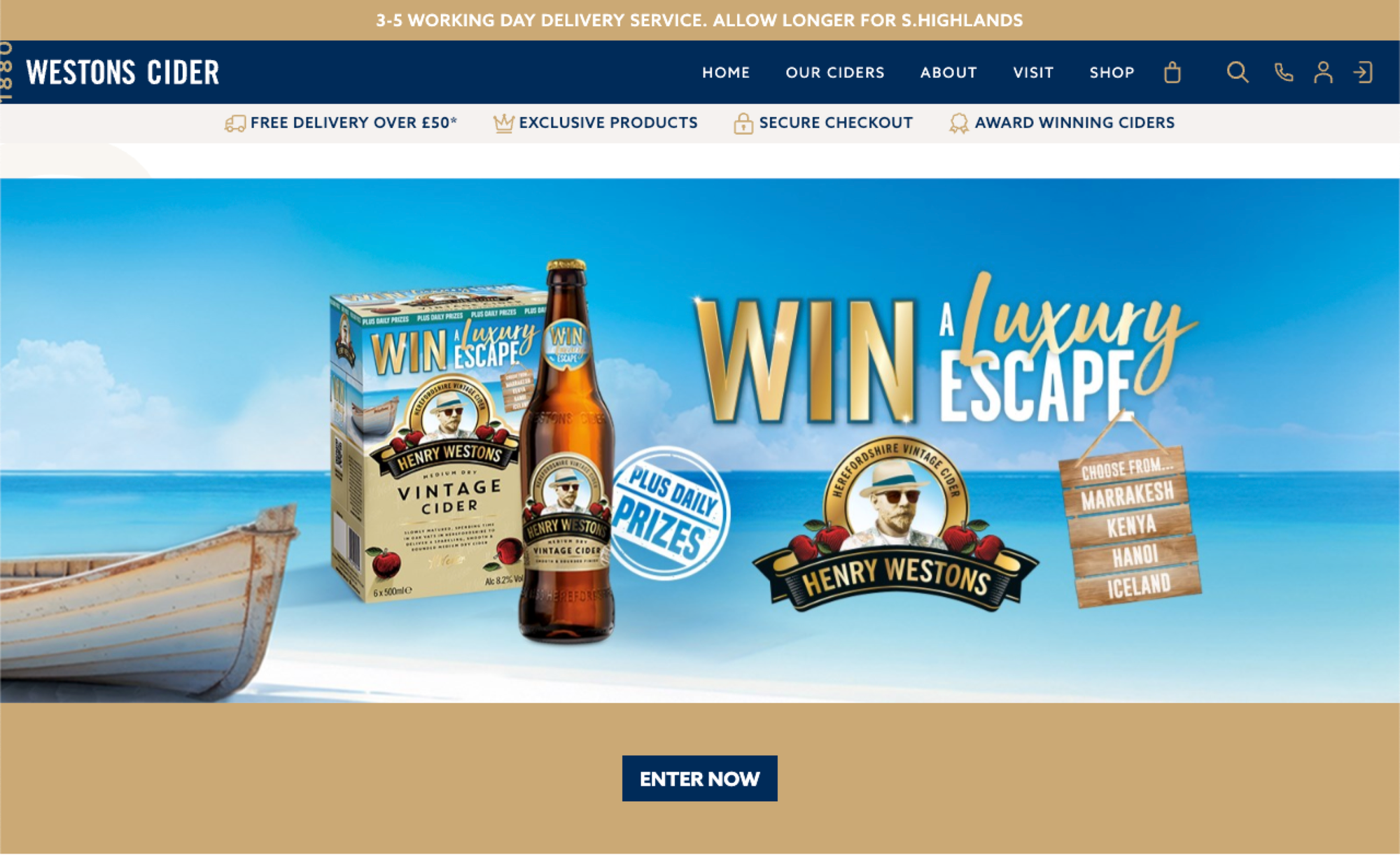
Consider a cider manufacturer like Westons: their homepage hero might gallantly showcase Henry Westons Vintage, their flagship product. But what of the visitor seeking Rosies Pig's fruity complexity or Stowford Press's classic appeal? The hero banner, in its noble attempt to highlight the best, has inadvertently ignored the rest.
This represents the fundamental flaw in the hero banner mentality: the assumption that one message can effectively serve an entire diverse audience. We've traded relevance for visual impact, segmentation for simplicity.
The Persistence of a Failing Formula
The hero banner's continued dominance isn't evidence of its effectiveness -it's a testament to our collective inability to imagine alternatives. Both clients and designers cling to the hero banner not because it works, but because it feels familiar. Despite its obvious responsive (mobile) challenges, the single, large canvas appeals to creative teams who can craft compelling visuals, whilst businesses appreciate the apparent simplicity of one unified message.
We've become so accustomed to the hero's presence that we've forgotten to question whether we still need saving in the same way. The popularity paradox means we continue implementing a design pattern that prioritises visual impact over user relevance, representing a broadcast mentality in an era that demands personalisation and segmentation.
When Heroes Work: The Exception That Proves the Rule
There are still moments when the traditional hero banner proves its worth. Site-wide sales that genuinely apply to all visitors, major brand announcements, or competitions can justify occupying that premium real estate with a single message. These scenarios work because they achieve true relevance across the entire audience -every visitor benefits from knowing about the sale or announcement.
However, even these scenarios reveal the limitations of the hero banner approach. Consider competitions: whilst initially relevant to all visitors, once a customer has entered, that prominent banner becomes wasted space. A composite banner system could dynamically replace the competition section with personalised product recommendations or other relevant content for returning users who've already participated.
These situations represent perhaps 10% of a typical e-commerce site's operational calendar. The remaining 90% of the time, we're using our most valuable digital space to broadcast messages that miss the mark for significant portions of our audience.
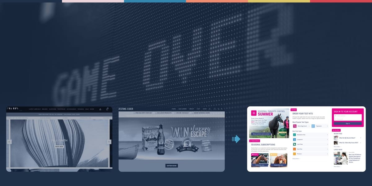
The Evolution: Composite Banner Architecture
The solution lies not in abandoning prominent homepage messaging, but in reimagining how we use this valuable screen real estate. Rather than surrendering the entire fold to a single message, we can create composite banners; masonry-style layouts that divide the space into multiple focused sections while maintaining visual cohesion.
This approach treats the homepage banner as a sophisticated dashboard rather than a billboard. Each section can address different audience segments, product categories, or messaging priorities, with the sizing and positioning reflecting their relative importance to the business.
Think of it as replacing a single spotlight with an intelligent lighting system; instead of illuminating one area brightly and leaving everything else in shadow, we create a balanced illumination that highlights multiple areas according to their importance.
Early Pioneers: Learning from 14 Years of Implementation
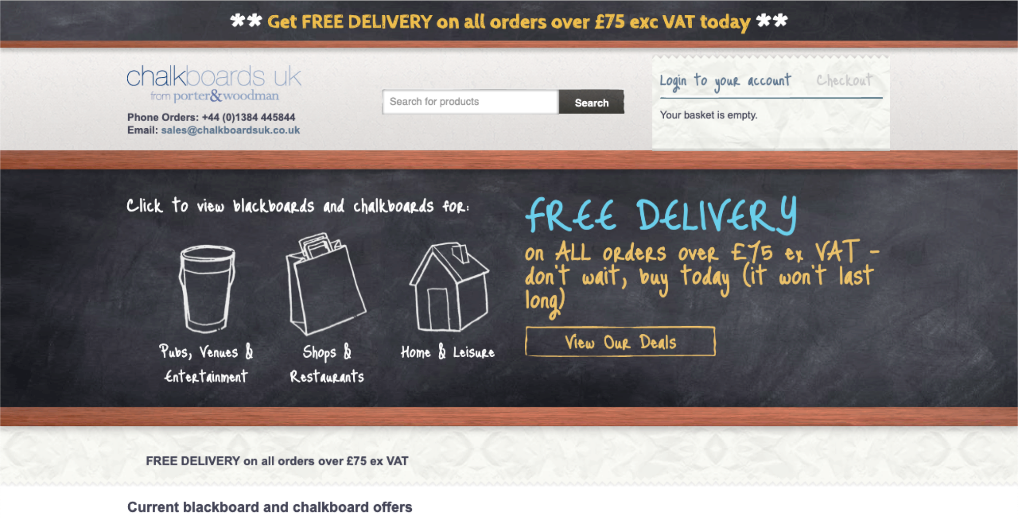
Our experience with composite banner architecture stretches back to 2011, when we first implemented this approach for Chalkboards UK. Even then, we recognised the limitation of trying to serve diverse customer motivations with a single message. By segmenting the banner space into key user motivations: Pubs, Shops, and Home; we ensured that visitors could immediately identify their relevant entry point.
This early implementation taught us crucial lessons about user behaviour and space allocation that would inform our approach for years to come. The concept wasn't yet called "composite banners," but the principle was clear: homepage real estate is too valuable to waste on one-size-fits-all messaging.
Case Study: Festive Sparkle's Segmented Success
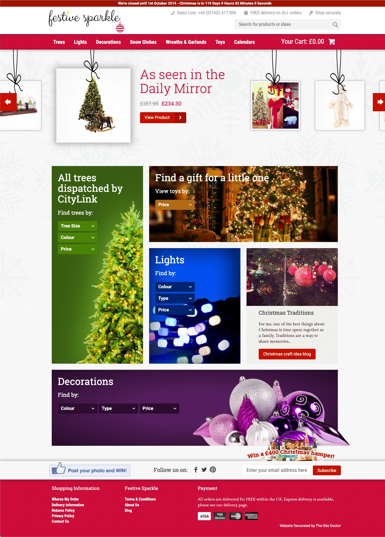
When we implemented this approach for Festive Sparkle in 2016, the results validated our thesis completely. By allocating banner space proportionally to product category performance, we ensured that every visitor encountered messaging relevant to their likely interests. The largest sections promoted the most popular items, whilst smaller areas addressed niche segments, transforming a one-size-fits-all approach into a nuanced, data-driven layout.
The outcome was measurable: increased click-through rates across all segments and improved time-on-site metrics as visitors found relevant content immediately upon arrival. Rather than forcing customers to scroll past irrelevant hero content, we presented them with multiple entry points into their areas of interest.
Advanced Implementation: Dynamic Prioritisation
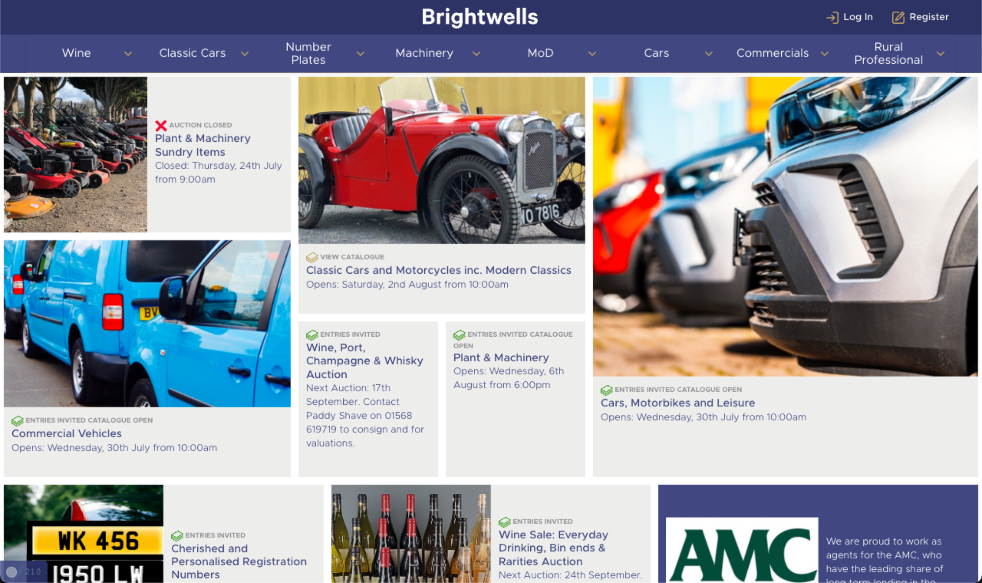
Brightwells Auctioneers represents the evolution of this concept into something more sophisticated. Their multi-department auction house faces the unique challenge of fairly representing diverse categories (from fine art to agricultural equipment) whilst highlighting time-sensitive sales information.
Their composite banner system dynamically adjusts prominence based on upcoming auctions, ensuring that the most urgent or significant sales occupy the largest spaces. This creates a self-optimising homepage that responds to business priorities whilst maintaining representation across all departments. When the fine art department has a major sale approaching, that section grows in prominence, but agricultural equipment buyers still see their relevant content above the fold.
The system also incorporates non-departmental content such as news and announcements, treating the homepage banner as a comprehensive communication centre rather than a single-purpose promotional space.
The Evolution Perfected: A Modern Implementation
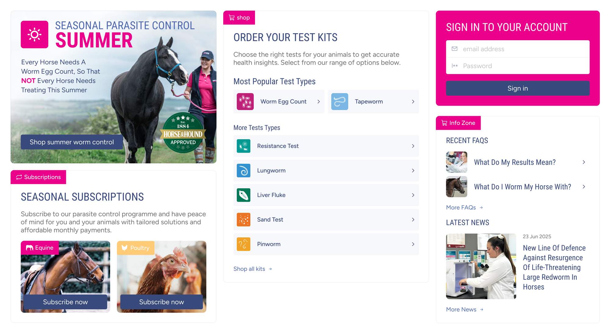
This represents the current state of the art in composite banner design. By learning from earlier implementations and incorporating modern design principles, this approach demonstrates how far we've come from the traditional hero banner model. The sophisticated use of space, clear visual hierarchy, and intelligent content prioritisation create an experience that serves multiple audience segments without sacrificing visual impact or brand coherence.
The Personalisation Revolution
The composite banner architecture creates unprecedented opportunities for personalisation that the traditional hero banner simply cannot match. As systems learn more about individual users, sections can subtly adjust in size, positioning, or content to reflect browsing history, purchase patterns, or demographic indicators.
A returning customer who previously purchased formal wear might see that section slightly enlarged on their next visit, whilst a first-time visitor sees a balanced representation of all categories. This evolution from static broadcasting to dynamic, user-centric messaging represents the future of homepage design -websites that adapt to their users rather than forcing users to adapt to them.
The technical implementation isn't particularly complex either. Modern content management systems can easily support rule-based section sizing, and more advanced implementations can incorporate machine learning to optimise layouts based on user behaviour patterns.
Beyond E-commerce: Universal Application
Whilst our focus has been on e-commerce applications, the composite banner concept addresses similar challenges across digital platforms. Corporate websites can balance service offerings without prioritising one unfairly. News sites can prioritise stories across different topics while maintaining editorial balance. Portfolio sites can showcase various skills or projects -all while maintaining the visual impact that makes hero banners appealing.
The principle remains consistent: rather than forcing a single message onto a diverse audience, we create space for multiple messages that can serve different audience segments simultaneously.
Measuring Success: Metrics That Matter
The shift from hero to composite banners requires different success metrics. Rather than measuring the click-through rate of a single element, we track engagement across multiple sections, time-to-relevance for different user segments, and overall conversion improvements from the homepage.
Early implementations consistently show:
- Increased overall banner engagement rates (20-40% improvements typical)
- Reduced bounce rates as users find relevant content faster (15-25% improvement)
- Higher customer satisfaction scores in user testing
- Improved conversion rates for secondary product categories (10-30% uplift)
- Average order value increases of 8-15% as customers discover additional relevant products
- Reduced customer acquisition costs through improved organic engagement
For a typical mid-market e-commerce site generating £2-5M annually, these improvements often translate to £150K-400K additional revenue in the first year, far exceeding the implementation costs of £15K-40K.
These metrics demonstrate that whilst individual sections might not achieve the raw click-through rates of a full-width hero, the combined effect creates superior user experiences and measurable business outcomes.
Implementation Strategy: A Practical Approach
For businesses considering this transition, the implementation doesn't require abandoning existing design systems entirely. Composite banners can utilise the same visual language, colour schemes, and brand elements as traditional heroes; they simply organise them more intelligently.
Risk Mitigation and Testing
Smart CMOs don't overhaul homepages without validation. The composite banner approach lends itself perfectly to gradual testing:
- A/B split testing between traditional hero and composite layouts
- Segment-specific testing to identify which audiences respond best
- Gradual rollout starting with less critical product categories
- Seasonal testing during lower-risk periods before peak trading
Most e-commerce and CMS platforms (Umbraco, Shopify Plus, Magento Commerce, WooCommerce) can support composite banners through existing page builders or modest custom development. The technical risk is minimal—if the approach doesn't work, reverting to traditional heroes takes hours, not weeks.
Content Strategy and Resource Planning
The shift does require more content planning than traditional heroes. Instead of one monthly banner update, teams typically manage 4-6 sections. However, this actually reduces pressure on individual content pieces - not every section needs to be refreshed simultaneously, and seasonal content can target specific segments rather than attempting to appeal to a universal audience.
Many clients find that composite banners actually reduce creative bottlenecks. Rather than waiting for the perfect single message that serves all audiences, teams can develop targeted content for specific segments in parallel.
Start by identifying your main audience segments and their corresponding product categories or messaging needs. Allocate space proportionally based on business data: revenue contribution, customer volume, or strategic priorities. The largest sections handle your core business, whilst smaller areas ensure comprehensive representation.
The key is maintaining visual hierarchy whilst creating multiple entry points. Users should still understand the primary focus of your business, but they shouldn't feel excluded if they belong to a secondary segment.
Building Internal Consensus
The biggest implementation challenge isn't technical; it's cultural. Designers often resist composite banners because they feel less "clean" than traditional heroes. Marketing teams worry about message dilution. Executives question why we're fixing something that "isn't broken."
The solution lies in framing composite banners not as a replacement for hero messaging, but as an evolution towards customer-centric design. Present it as personalisation at scale -the same strategic direction driving email segmentation, paid advertising targeting, and product recommendations.
Key stakeholder arguments that resonate:
- For Designers: "More creative opportunities across multiple canvases, not fewer"
- For Marketing: "Message amplification through segmentation, not dilution"
- For Executives: "Measurable improvement in homepage conversion with minimal risk"
- For IT: "Evolution of existing systems, not wholesale replacement"
Competitive Positioning
Whilst composite banners aren't yet mainstream, early adopters consistently report competitive advantages in user experience and conversion rates. The approach positions businesses as customer-focused innovators rather than followers of generic design trends.
Most importantly, composite banners future-proof homepage strategies. As personalisation technology advances, the segmented architecture provides a foundation for AI-driven content optimisation that traditional heroes simply cannot support.
The Path Forward: From Broadcast to Conversation
As e-commerce becomes increasingly sophisticated, clinging to outdated design patterns becomes a competitive disadvantage. The composite banner approach offers a practical evolution that respects both design aesthetics and user experience principles.
The question isn't whether to abandon hero banners entirely, but how to evolve them into something more inclusive and effective. By treating homepage prominence as a shared resource rather than a singular opportunity, we create experiences that serve broader audiences whilst maintaining the visual impact that makes first impressions count.
The Hero's Legacy
The traditional hero banner served its purpose during the early days of web commerce, when simpler businesses served simpler needs. But as our digital landscape has evolved, so too must our design approaches. The death of the hero banner doesn't represent a failure; it represents progress.
In its place, we're building something better: responsive, inclusive, and intelligent homepage designs that serve real users with real needs, rather than broadcasting single messages into the void. The age of the digital hero is ending, but the age of truly user-centric design is just beginning.
For CMOs evaluating new e-commerce implementations, the question isn't whether composite banners represent the future -the data already confirms their effectiveness. The question is whether your business can afford to launch with yesterday's approach whilst competitors embrace tomorrow's opportunities.
The composite banner isn't just a design trend -it's a fundamental shift towards more respectful, effective user experiences. Our websites should adapt to our customers, not the other way around.
Taking Action: Next Steps for Decision Makers
If you're planning an e-commerce website implementation or major redesign:
- Audit your current hero banner performance - measure engagement by audience segment
- Identify your key customer segments and their distinct needs
- Request composite banner concepts from your design team alongside traditional options
- Plan A/B testing infrastructure to validate the approach with real users
- Build gradual rollout timelines to minimise risk while maximising learning
The most successful implementations start with understanding that homepage real estate is too valuable to waste on single messages. Your diverse customer base deserves better than one-size-fits-all solutions.
What approaches has your organisation taken to optimise homepage messaging? The evolution from broadcast to personalised experiences represents one of the most significant opportunities in current e-commerce design.